Most AI does the work for you. OTTO does it with you.
A small desk device that shows you how to finish your work instead of doing it for you. Hardware and software, designed together.


An assistant that helps you finish tasks, and helps you learn.
OTTO is a desktop companion that sits beside your screen and works with you, not for you. It follows along with your project, steps in when you're stuck, and helps you build the skill instead of handing you the answer.
A work sidekick with a place on your desk
OTTO gives your AI agent a physical home beside your screen. It sees what you're working on and helps without getting in the way.
Keeps you focused
OTTO has its own screen next to your monitor, so you can ask for help without leaving your work.

Helps you learn as you go
Each task is broken into steps with the real commands and shortcuts, so you see how it's done and can do it yourself next time.

Knows what you're working on
OTTO pairs with your computer and follows the app you have open, so you never have to explain your project.

Keeps your whole day in view
The screen is built from cards, task to a card, like the sticky notes around your monitor - so you always know what to get done and when.


Currently the better an assistant gets, the less you learn.
AI tools work one prompt at a time, in a window apart from your work. Over time, that costs you focus now and skill later. That's the gap OTTO was designed to close.
Losing focus from the main task
AI lives in a separate window, so every question pulls you out of your work to explain it.

Lack of control on the output
Results come back incomplete or off, and you can't see or steer how they got there.
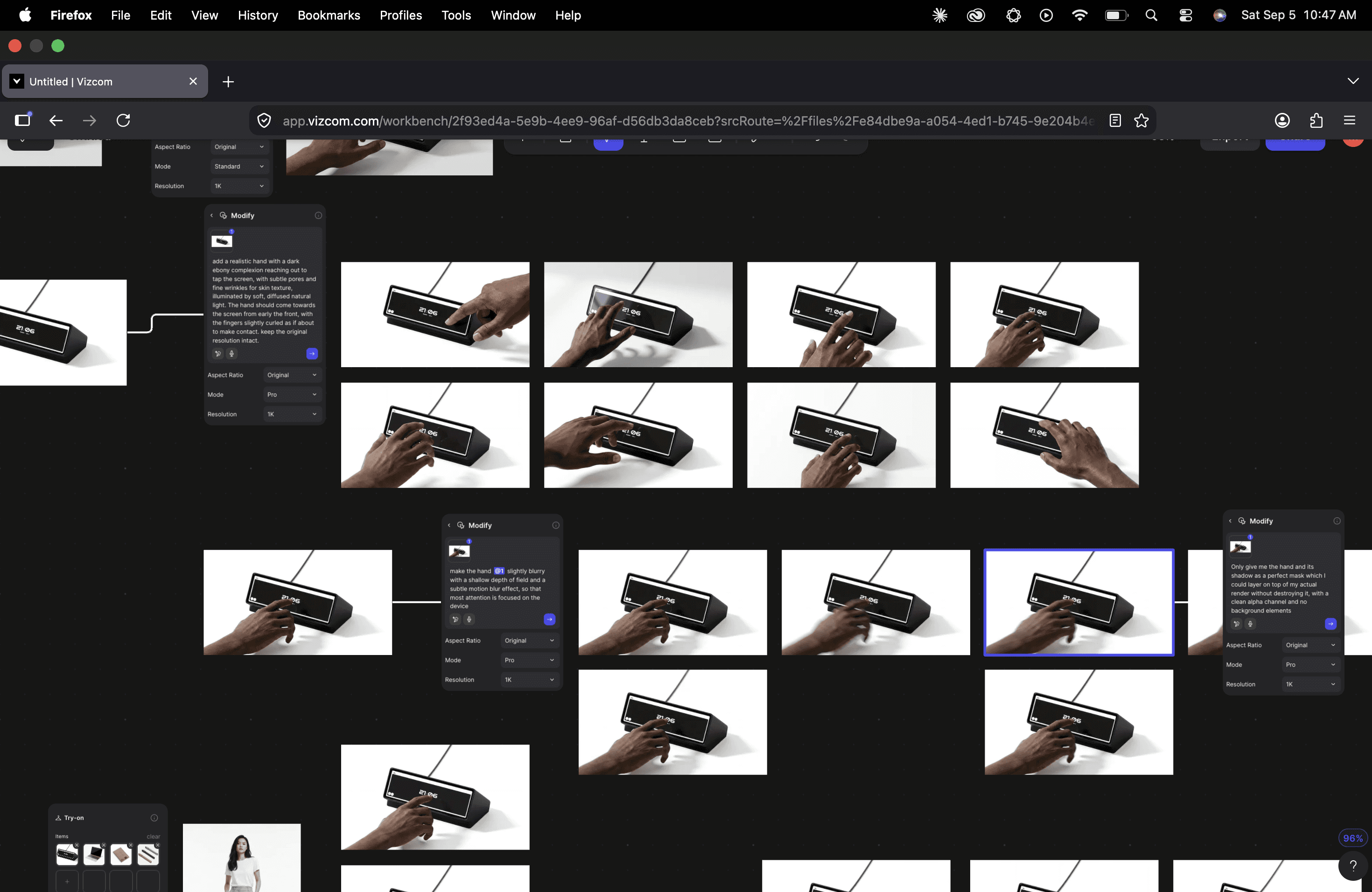
Missing context on accurte result
The tool only sees one prompt, not the project behind it, so you have to re-explain what you're building every time.
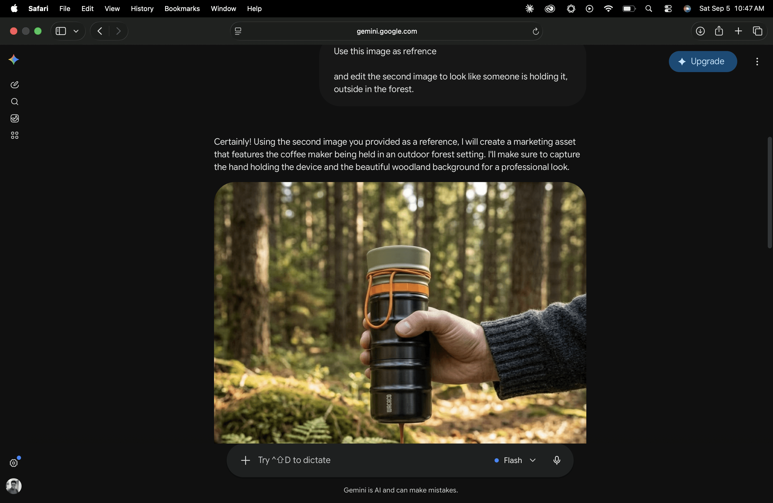

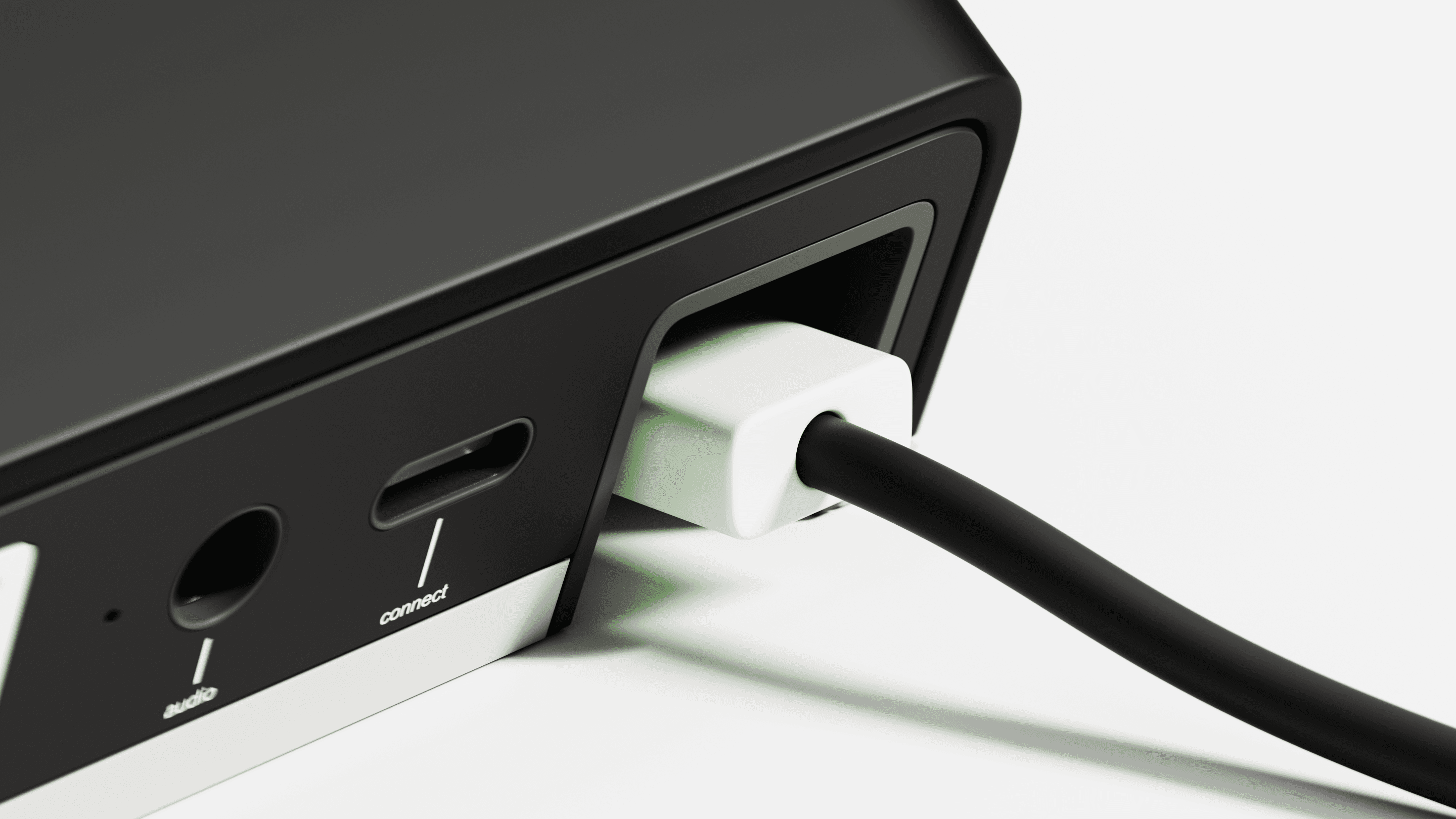


Three Principles Behind OTTO
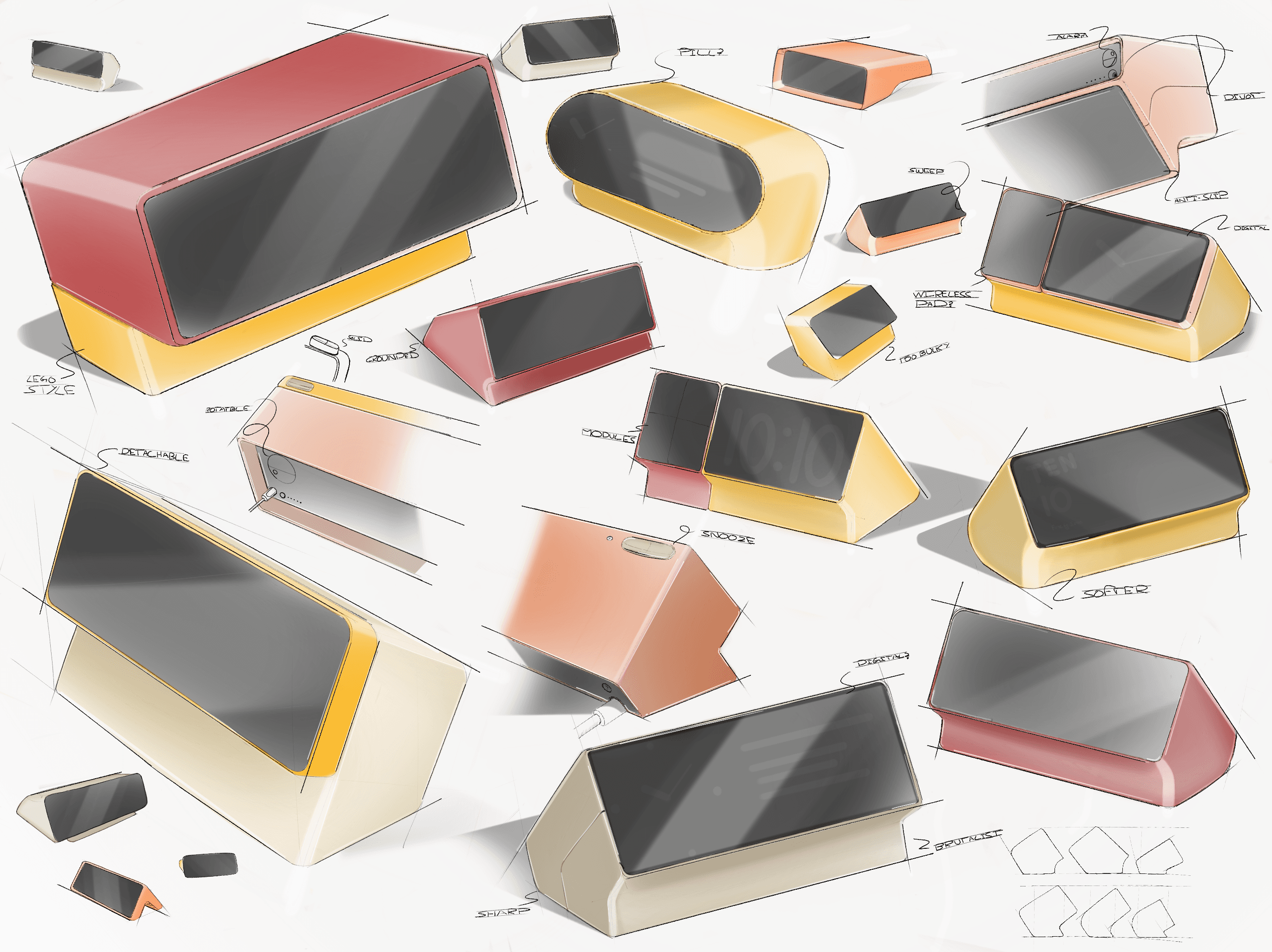
Finding a shape that belongs on a desk
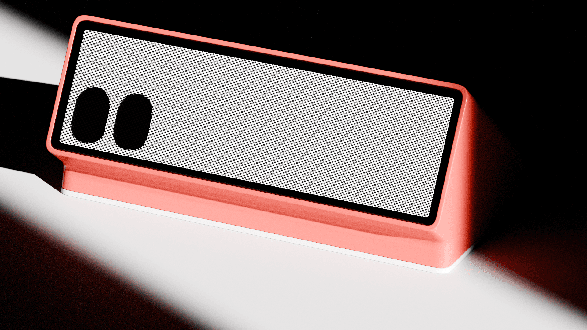
I sketched wide, low forms that could hold a readable screen in a body small enough not to feel like another computer. Angling the screen upward kept information glanceable without OTTO facing you head-on. The wedge won because it does that with no moving parts.

Scale and stance are hard to judge on screen, so each stage went onto the print bed, and a few rounds of radii studies followed before the form felt right in hand.


A Digital Sticky Note
The reference was sitting on the desk the whole time. Sticky notes work because each one holds a single thing, you can scan them all at once, and you pull the one you need to the front.
So the interface is built from rectangular cards, each holding one task, reminder or step list. They swap in and out as your day moves, and expand when you need to work inside one. The rest stay visible in the corner of your eye.


Rough wireframes from Figma went into Claude Design as a starting point, so I could compare card layouts quickly. Five or six components on a screen turned into clutter, so it settled at one large active component, a task component beside it, and a scrollable list of widgets underneath.


These visuals were about seeing whether OTTO belongs somewhere real: next to a monitor, on a desk that's already busy. Small enough to sit there without asking for attention, and clear enough to read in a glance when you need it.
That's the whole idea behind the project. Help that stays beside your work rather than in front of it, and leaves you a little better at the thing you were doing.



05 — 06
Bloomcase
Industrial Design

02 — 06
MokaMax
Lifestyle product Design